Rebrand: The Why, How & What Behind It

The Why
The world has changed so much since I started Super Creative in 2018, unprecedented times and all that, and so has my work, my brand, and myself. When I first started, I was had a fulltime job, did some occasional side gigs, and sold products with a smaller following. Now almost 5 years later, I’m working under my brand fulltime, working with rad clients, developing digital products, and building a reputable brand people can trust. All this change called for a fresh new rebrand.
The How
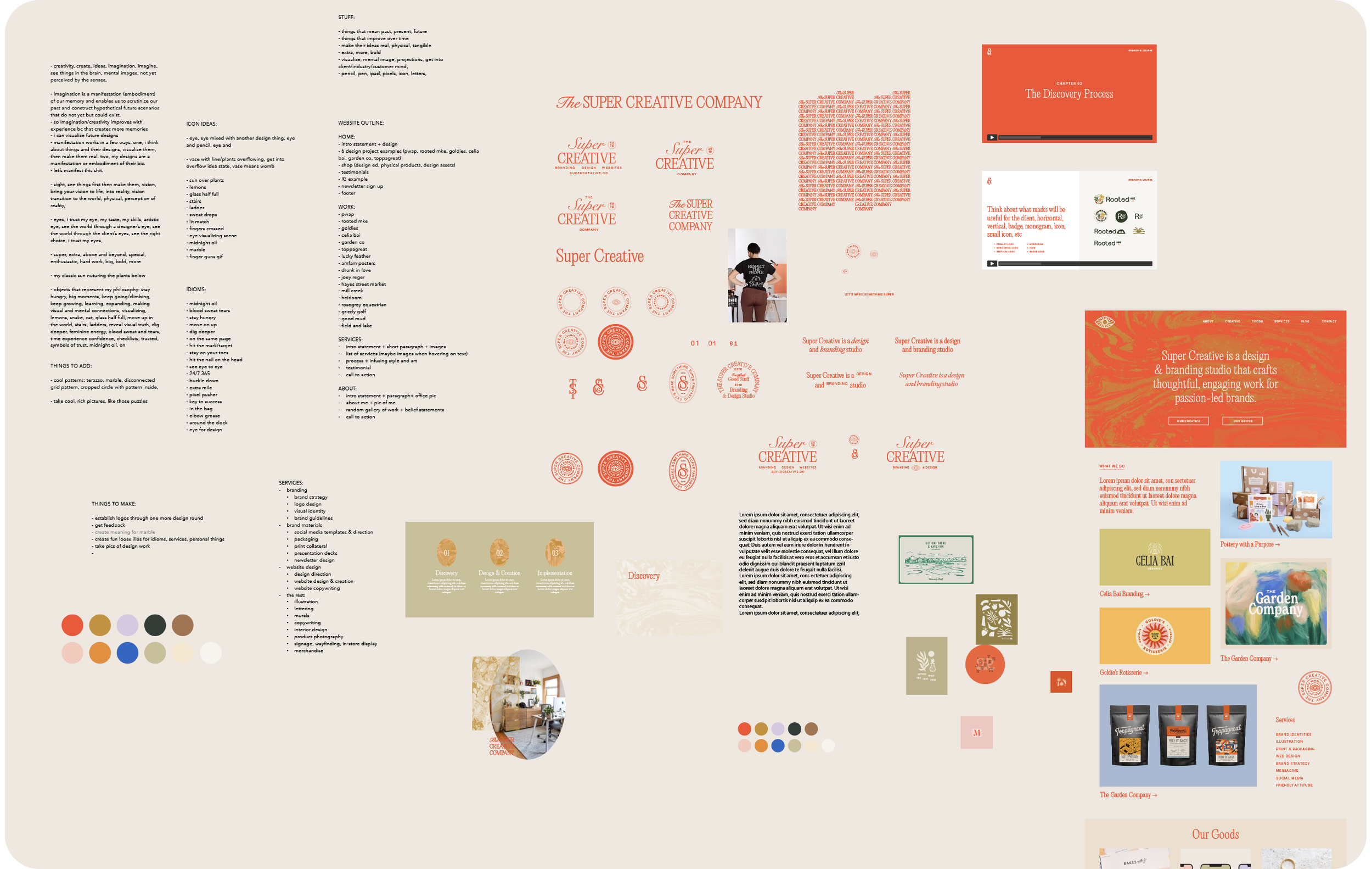
When I began my rebrand back in March 2022, I started by analyzing how I concept, create, and design. I wrote down things that caught my eye, interesting facts, and phrases/idioms I identify with. This kind of creative self reflection was most fruitful when I was in an inspired creative flow state which allowed me to generate a ton of ideas. I also did some of my own brand strategy but that’s a story for another email. After some visual inspiration searching and ideas on paper, I selected a few concepts and styles I liked, type and colors that sent the right message, and some secondary assets to keep things interesting, and put it all together!
The What
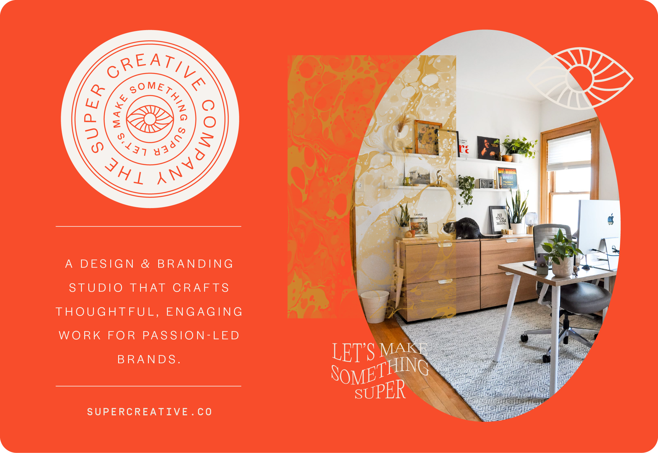
There’s a lot that goes into a brand but for the sake of this email, I’ll break it down into the icon, typography, color palette, and textures.
The Icon
From all those brainstormed ideas, facts, and idioms, the one that resonated the most with me was a creative vision imagined in my mind’s eye. When using your creativity, you can imagine things that don’t exist yet, and can see things in your mind, through your mind’s eye (unless you’re one of those unfortunate people who can’t, wild!). The eye icon represents that creative mental vision, and the swirls inside the eye symbolize the 'ah-ha' moment when you envision something special.
The Typography
As a frequent browser of Typewolf’s blog, I discovered the font Editorial New. It had such a neat 80s/90s editorial vibe, which feels cool, professional, and higher-end, all things I'm going for with my new positioning. I also use Halyard for subheads for a modern touch, Simplon Mono for numbers to feel a little technical/utilitarian, and Adobe Garamond for most body copy keeping with the vintage editorial vibe. I like mixing lots of fonts lol. And from these typography selections, I did what I do and made a ton of secondary logos and lockups.

The Color Palette
I’ve always been drawn to the color hot red, it’s just so bright and kick ass! That was an obvious inclusion. I used to use a ton of millennial pink but that trend was on its way out a while ago. It’s still in the palette but its priority has been replaced by mustard, earthy greens, and creams which feels more mature. And since I’m a designer, I can trust my gut and use many colors in my brand palette, as long as I stay true to the core colors.

The Texture
As you’ve probably noticed, one of the loudest parts of my rebrand is the use of marble / ink or paint in water textures. I’ve been a marble fan since my basic days and just didn’t want to let it go. I downloaded some marble-y images from Unsplash, used my fav opacity mask trick, and found I could change the textures to whatever color combo I wanted! To get real conceptual about it, to me, these textures represent how branding and graphic design can be the perfect mixing and blending of art and business. While they’re not one in the same, they can interact and play off one another in beautiful, unique, intentional ways. So there’s that, and I think it looks cool as hell lol.

The Future
If you’re still reading, dang you’re cool, thank you. This new brand represents the growth I've made as a designer and creative, and I'm excited to see what the future holds. I hope that this new brand will attract bigger, more amazing clients, leading to fresh, artful work and allows me to branch out into creative education and resources to share. I can't wait to see what the future holds!