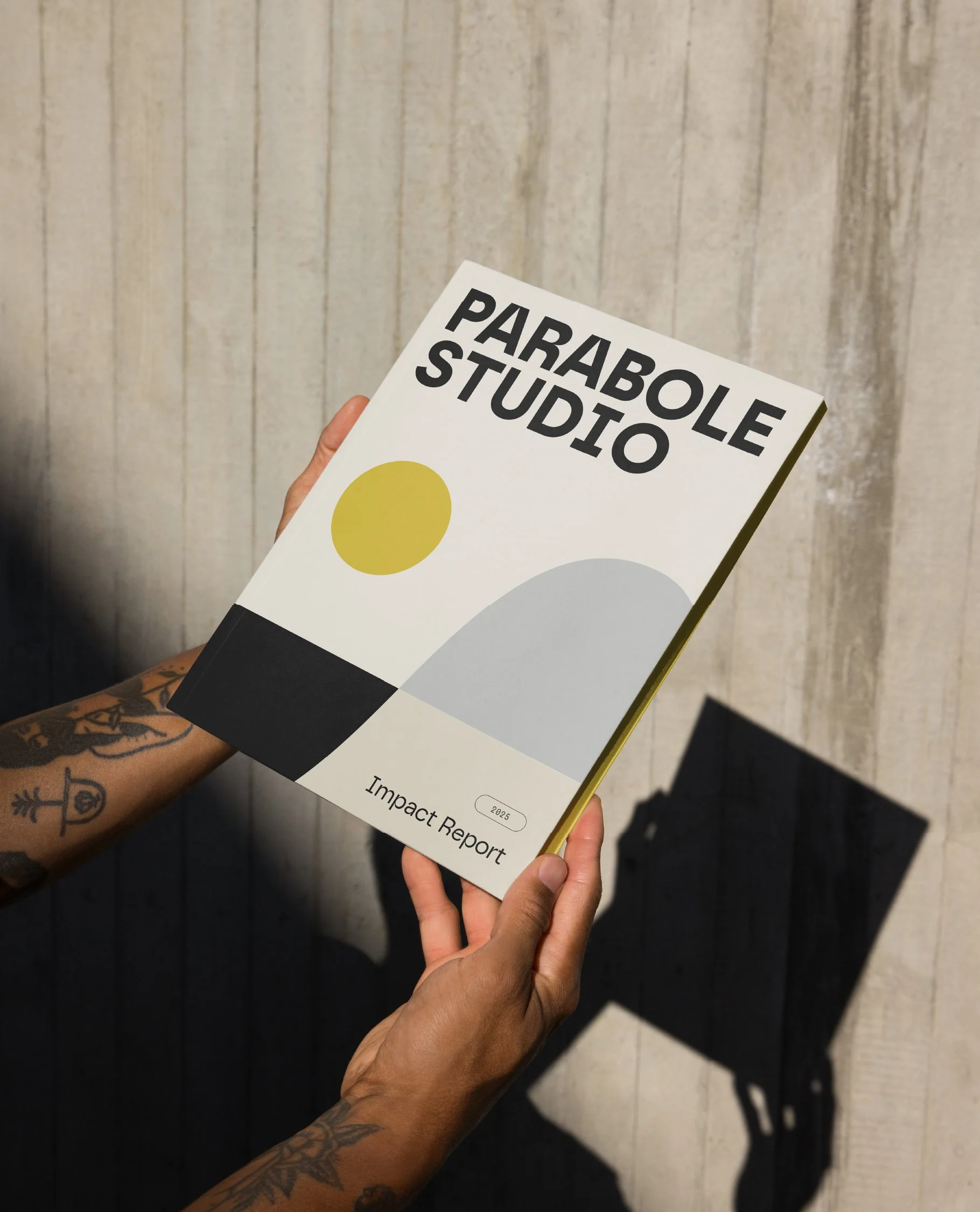
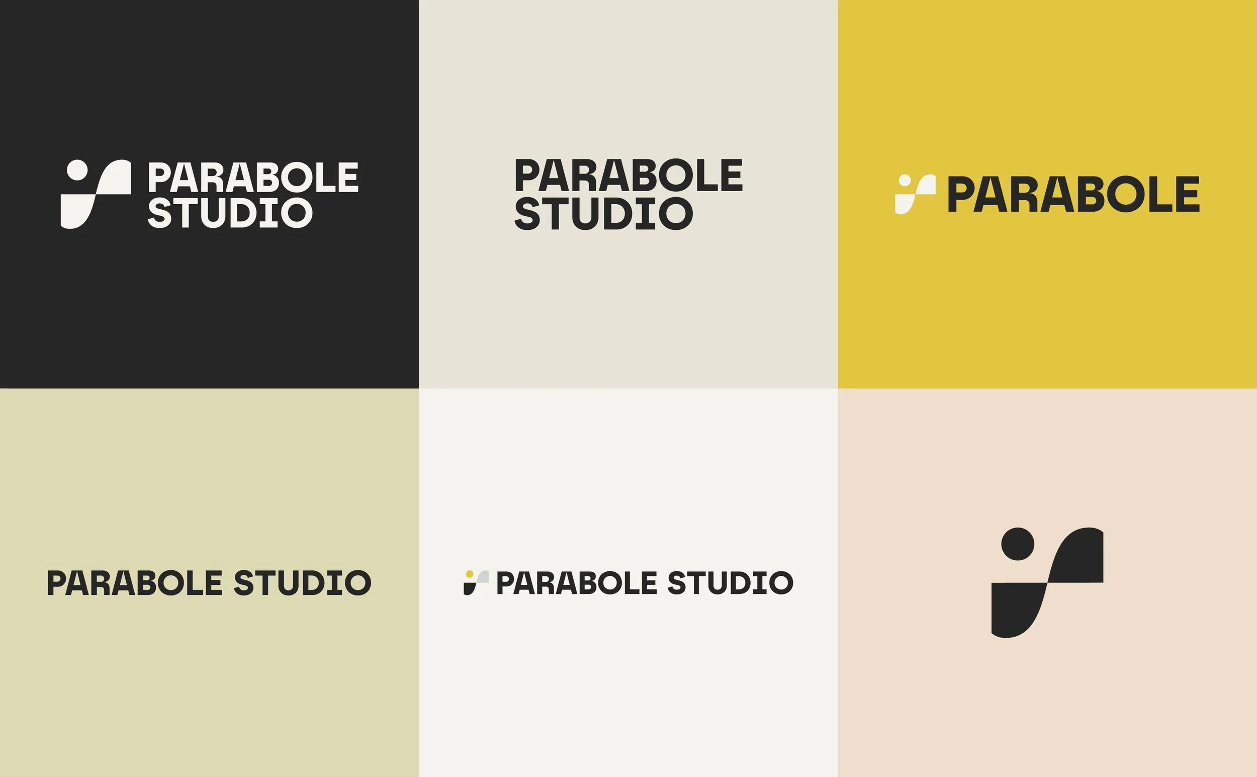
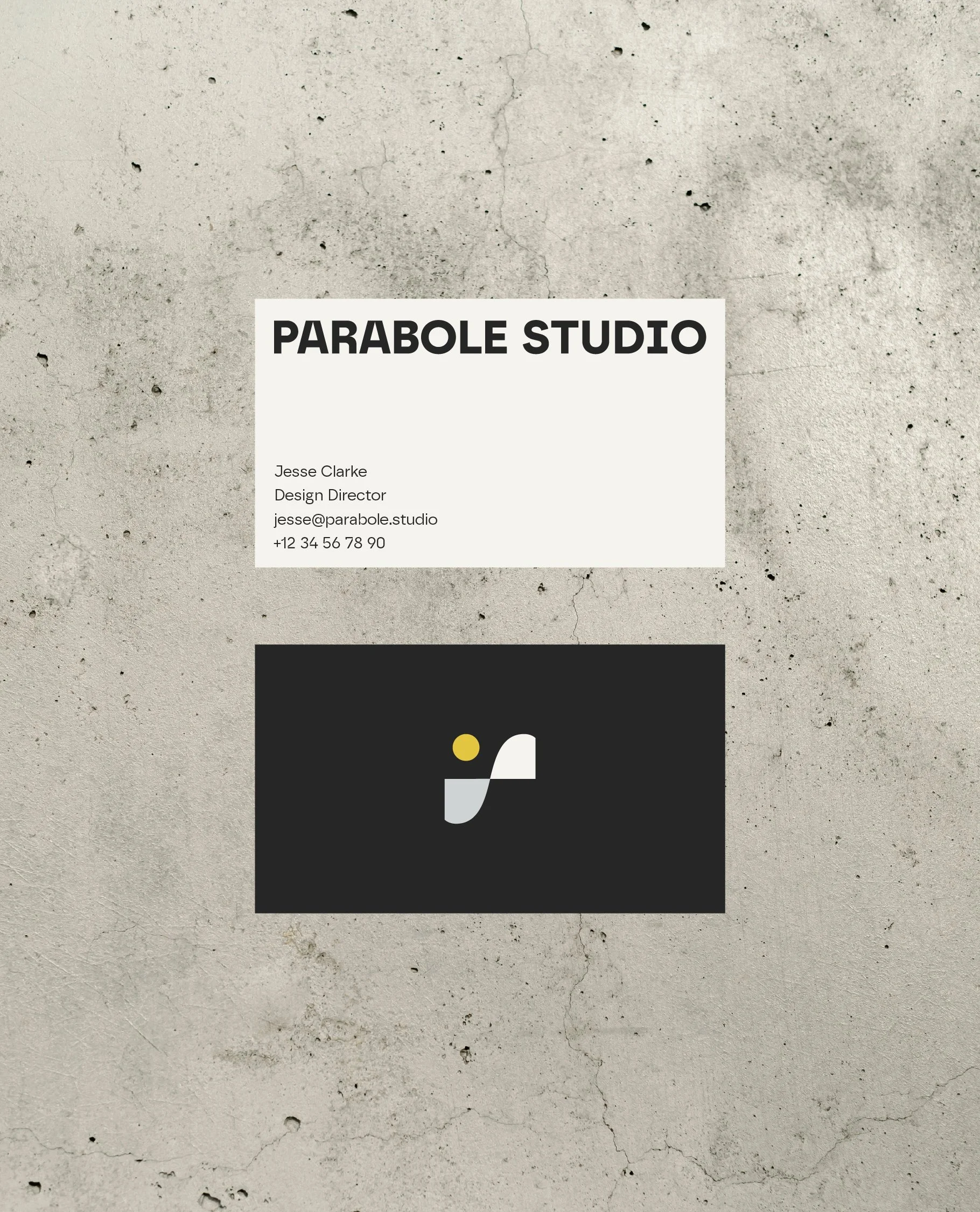
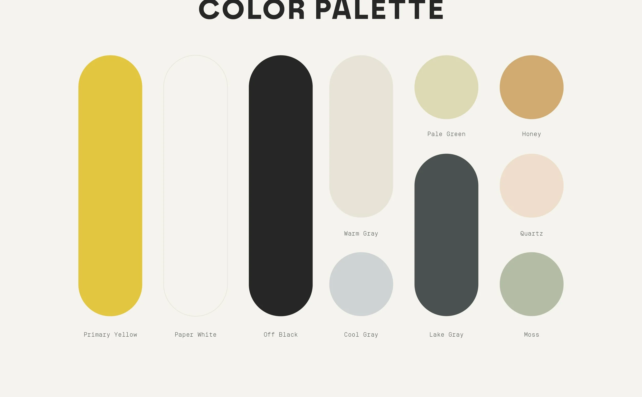
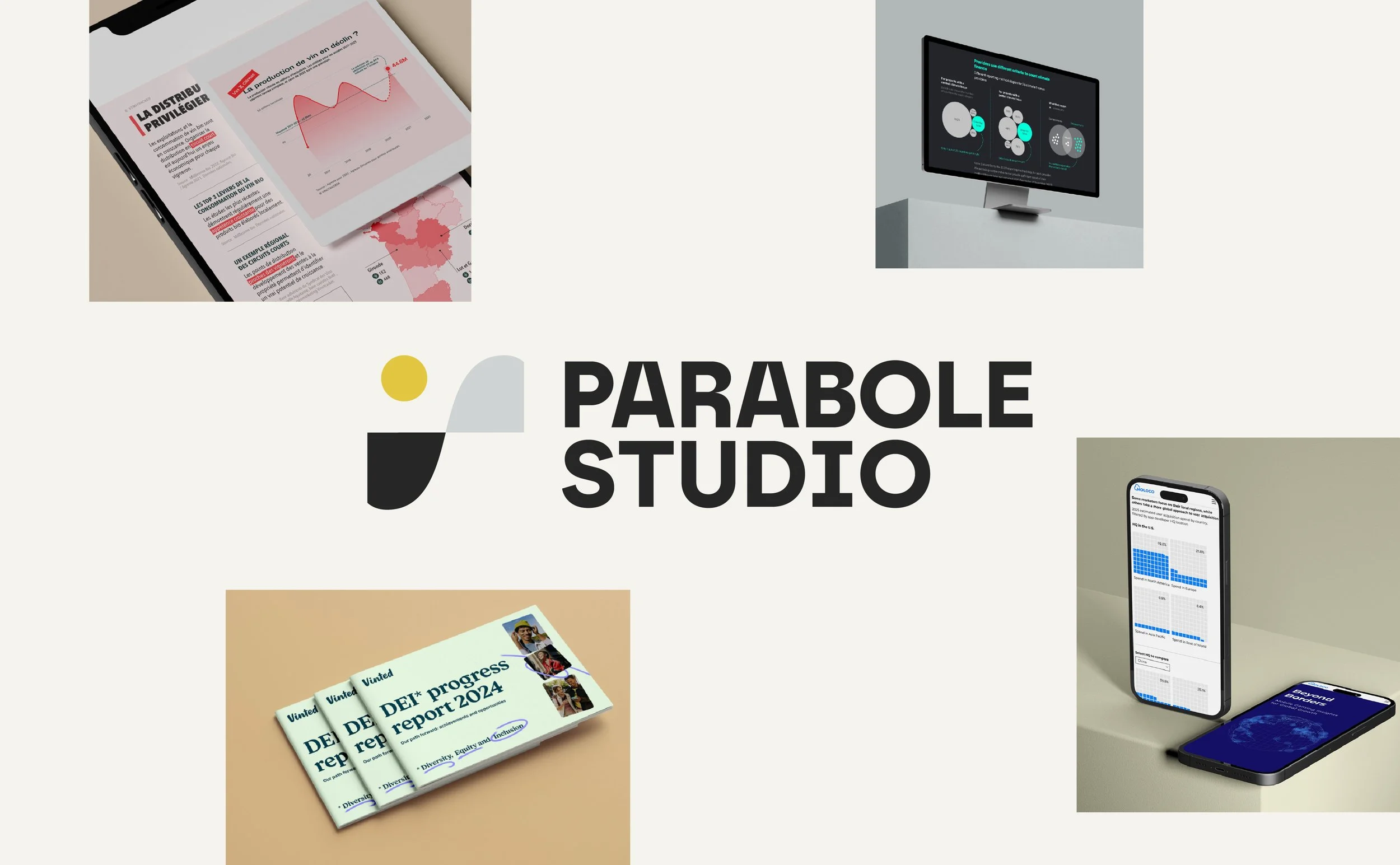
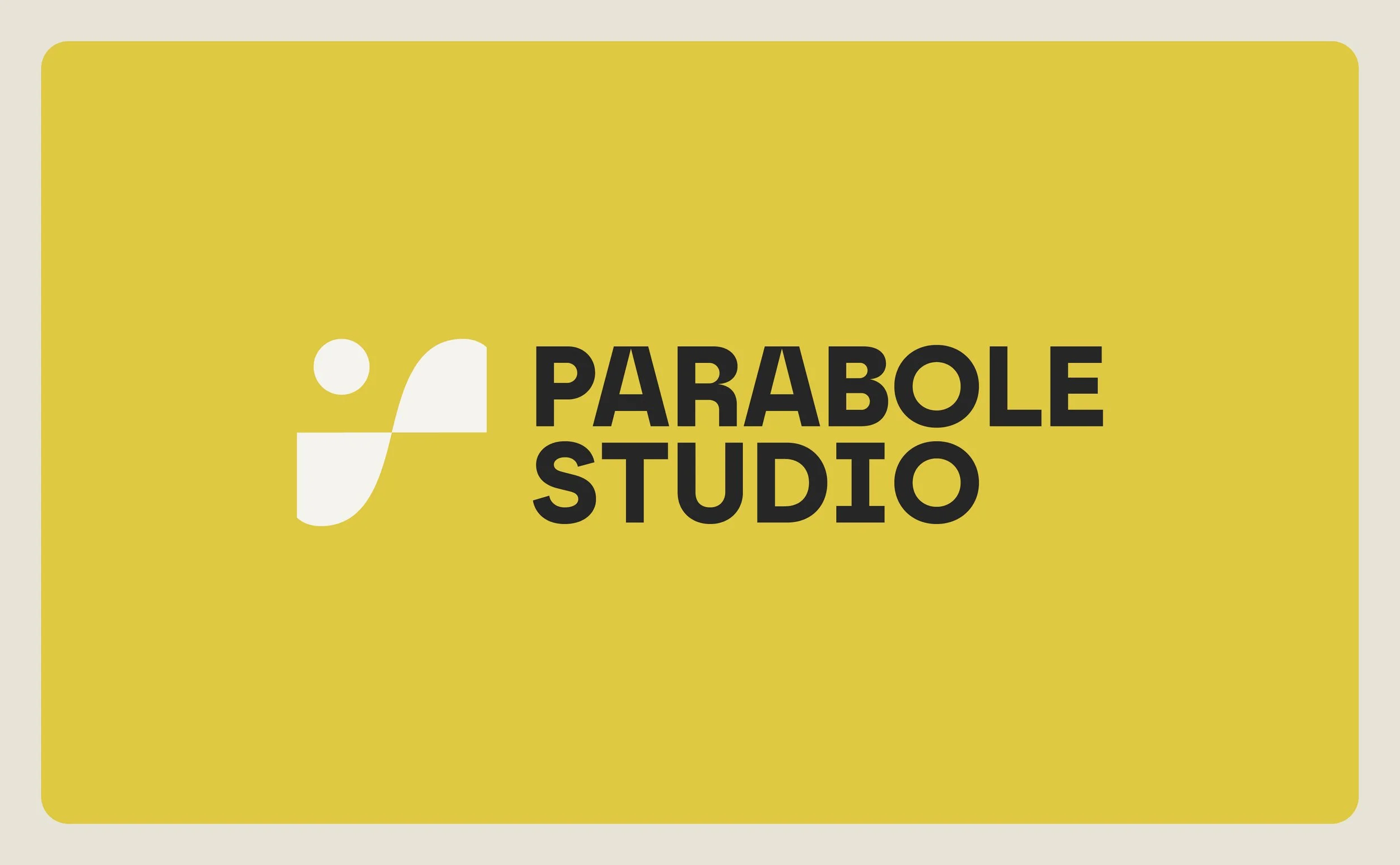
Parabole is communications studio specializing in data storytelling. The logo represents a data story. Minimalist shapes come together to form a narrative arc—rising action, climax, and falling action—while also symbolizing a simple graph or diagram. Together, the forms can be read as an abstract landscape, portraying the journey at the heart of a well-told story. The all caps wordmark is modern and practical, and the color palette carries their original bright yellow while balancing it with unique muted tones. The rest of the identity is contemporary, minimal, yet friendly and thoughtful.
Parabole Studio
ROLES
Creative Direction: Super Creative
Graphic Design: Sam Sieger