Designing Lahome’s Brand Identity
As a brand designer, I work with many clients across many industries but I’m always particularly excited to work on B2C brands, especially when they fall within one of my own interests. Lahome, a rug manufacturer, reached out to me via Behance in September 2022 in search of a designer to create a fresh, comprehensive brand identity. For almost 10 years, they had been selling their products mostly on Amazon so their wasn’t a huge need for a customer facing brand. In 2022, they decided to rebrand in an effort to become a more well-known, direct to consumer brand in the American market. After a bit of negotiation, the contract was signed, invoice paid, and project booked for early 2023.

Since Lahome wanted a top to bottom refresh, they opted for our large package that includes brand strategy, a full logo suite, brand marks, a type system, color palette, illustrations, patterns, photography direction, and a 40+ page brand guide. They also signed on for a few other projects, like packaging, social media templates, print collateral, and website assistance.
We kicked things off with the brand strategy. After the client provided their brand questionnaire answers, my copywriter, Anna, and I set to work. Lahome’s rugs are machine washable, they’re very soft and comfortable, they’re made with quality materials, and they’re very budget friendly. We kept those main pillars in mind while crafting the strategy. We started with the main brand statements such as their purpose, mission, vision, values, and positioning. Then included a comprehensive competitive analysis and customer persona breakdown. And lastly, we established their brand voice, complete with taglines and brand lines (our list of extra, less official taglines). After a bit of back and forth, the strategy was set.

With the strategy in mind, we began the visual identity process. I always start each brand with mood boards as this allows us to map out all the concept, specific elements, and styles of the upcoming identity before we even begin designing. This gets everyone on the same page and allows us to provide examples of our vision for the brand. The mood boards include a bit of client background info, a general concept per direction, and a corresponding mood board with inspiration images (logos, fonts, colors, packaging, photos, websites, etc.). There were a lot of paths the Lahome brand could pursue so we created 4 directions. After some debate, a visual direction was approved. They opted for the clean, warm, moderately refined and artful, cozy direction called Comforts of Home.

^ the inspiration before I organized it into a clean, logical mood board.
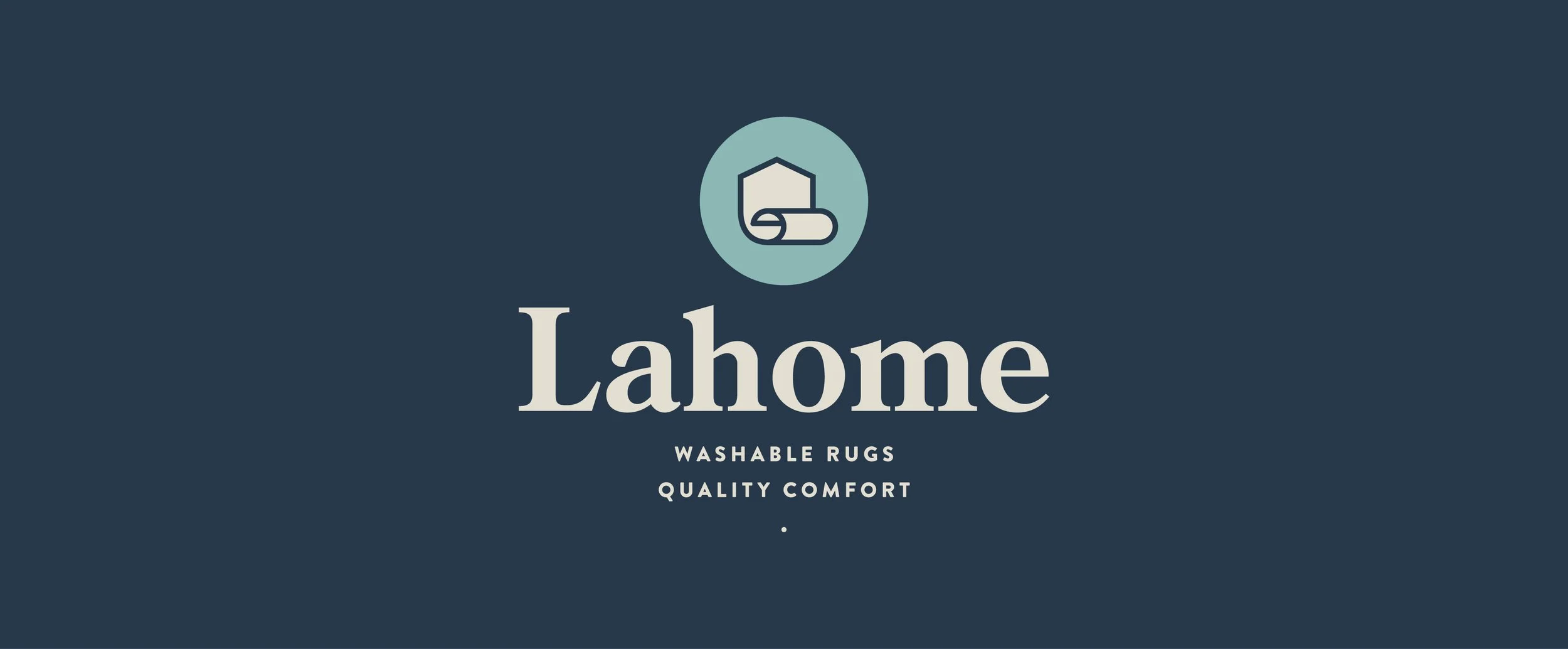
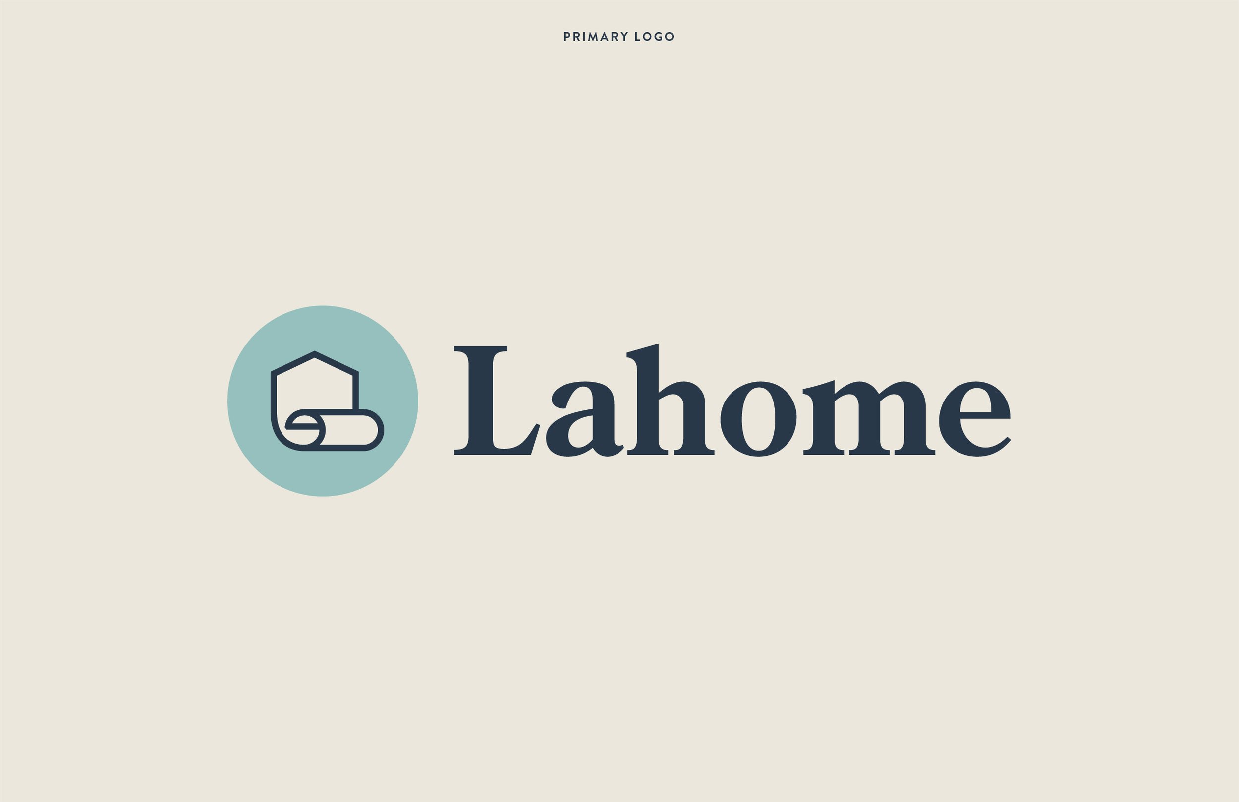
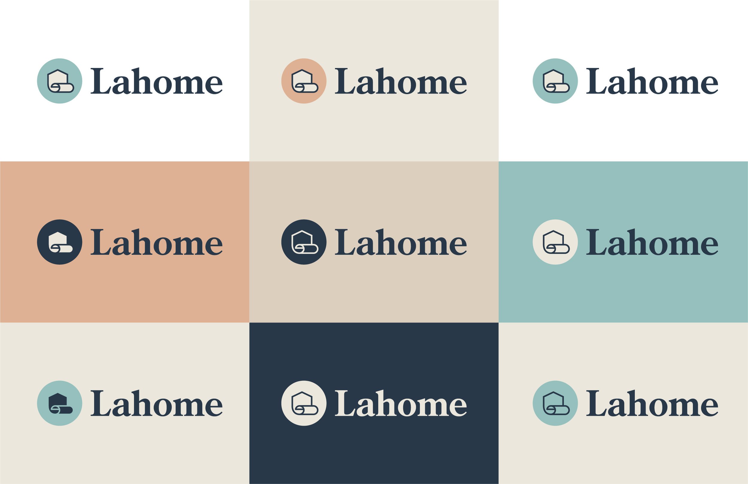
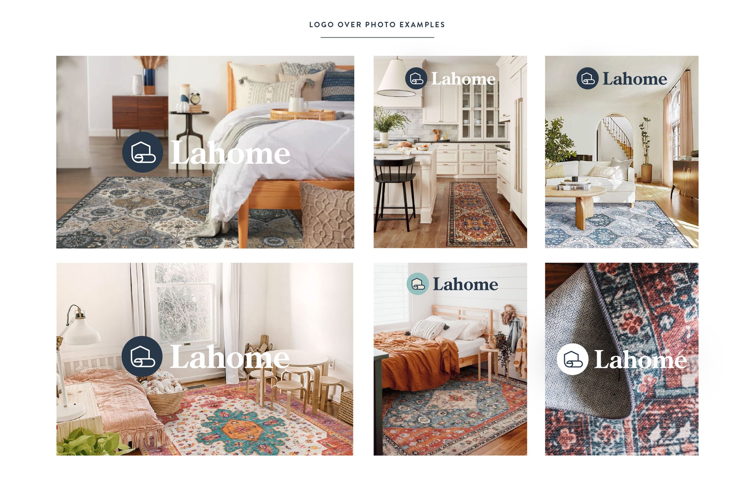
Now to the big task, the logo design. While I have a process I follow for logo design, each client and project is always a little different. I knew Lahome needed a very clean, recognizable, meaning icon along with a wordmark that can also stand on its own. I tried dozens of ways to make the L into a rug, many attempts at an LH monogram, more abstract icons, more rug-like icons, ways to merge a home and a rug. So. Many. Versions. Admittedly, this project did exceed the agreed upon number of revisions, but I was so determined to find the right mark and I was passionate about the project, I let the scope creep a bit more than usual. After several rounds, we finally landed on a logo! The icon simply merges the universal house symbol with an unrolled rug, aptly combining the concepts of home and rugs. The icon was paired with a timeless and comfortable serif wordmark.
^ final approved logo!
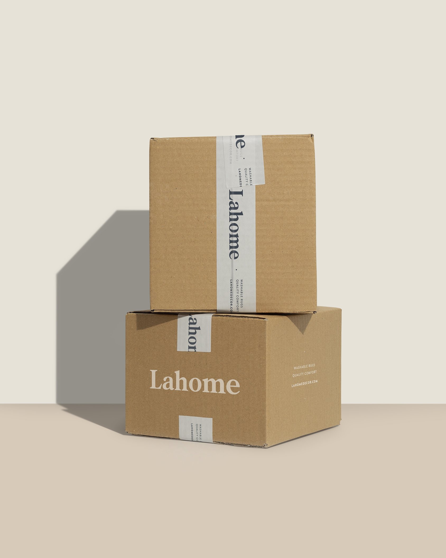
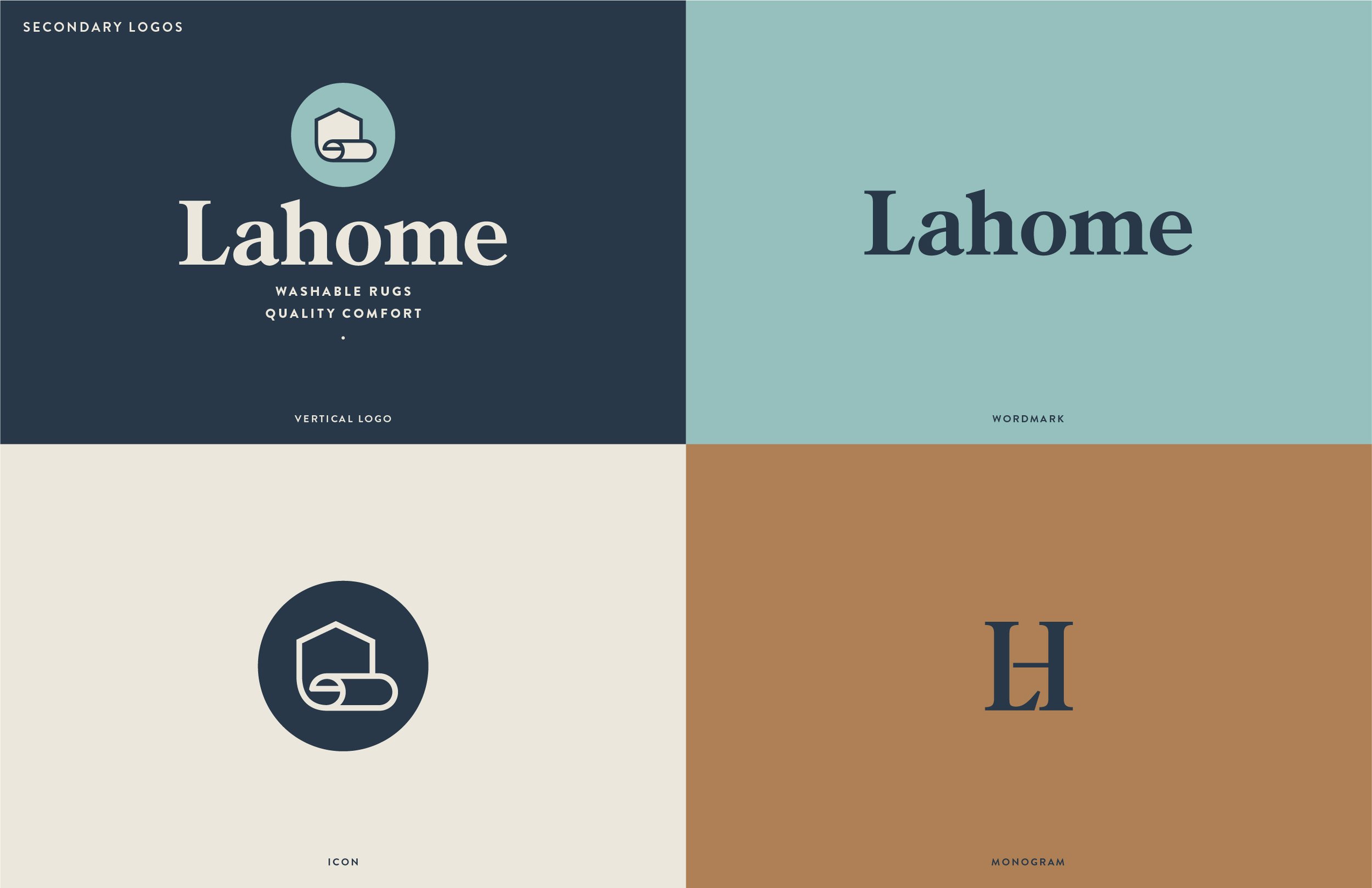
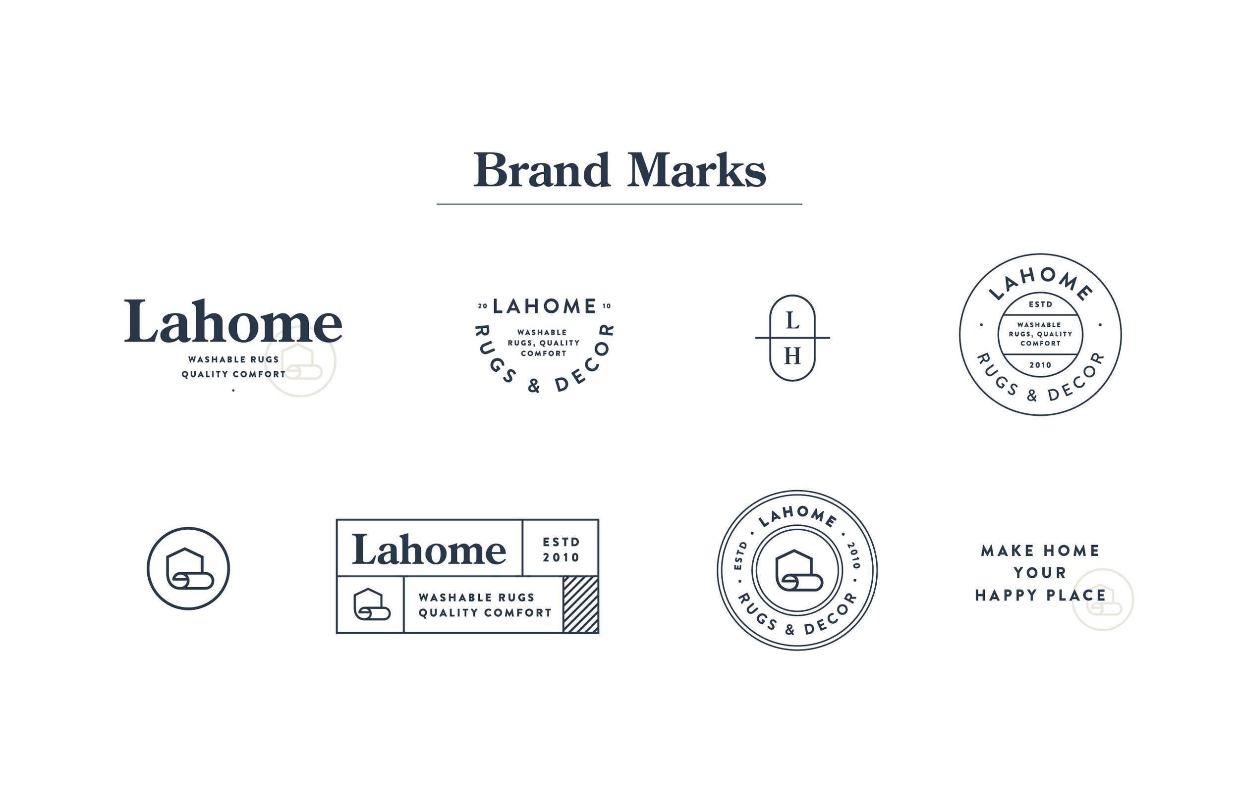
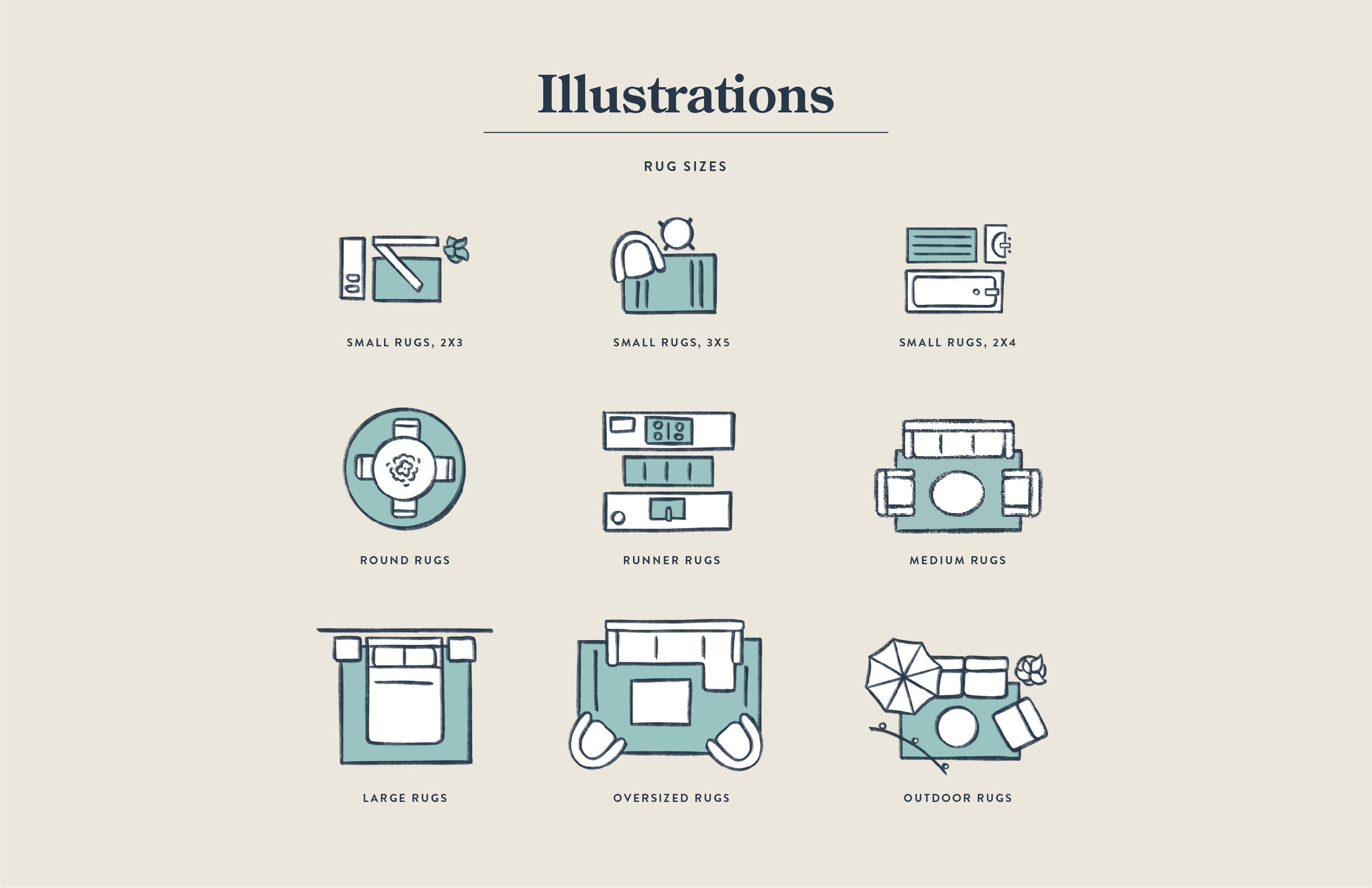
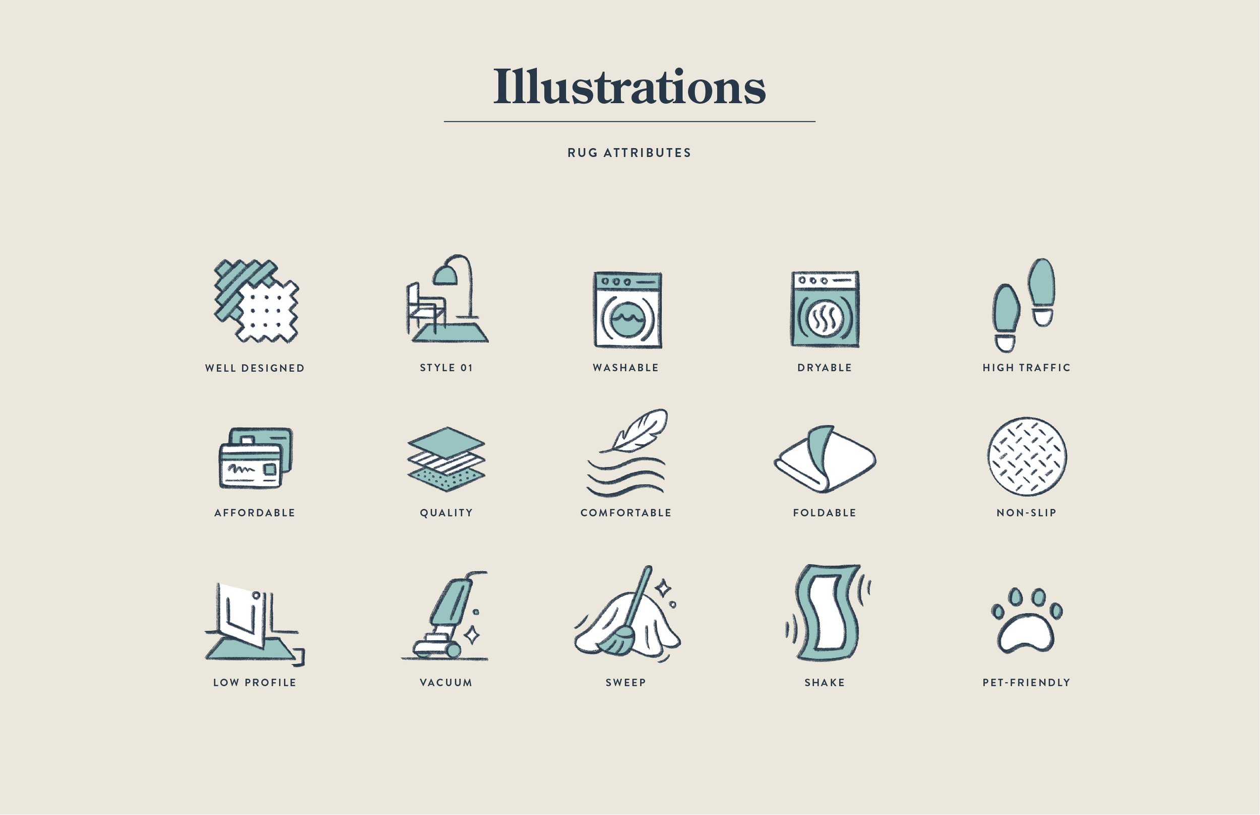
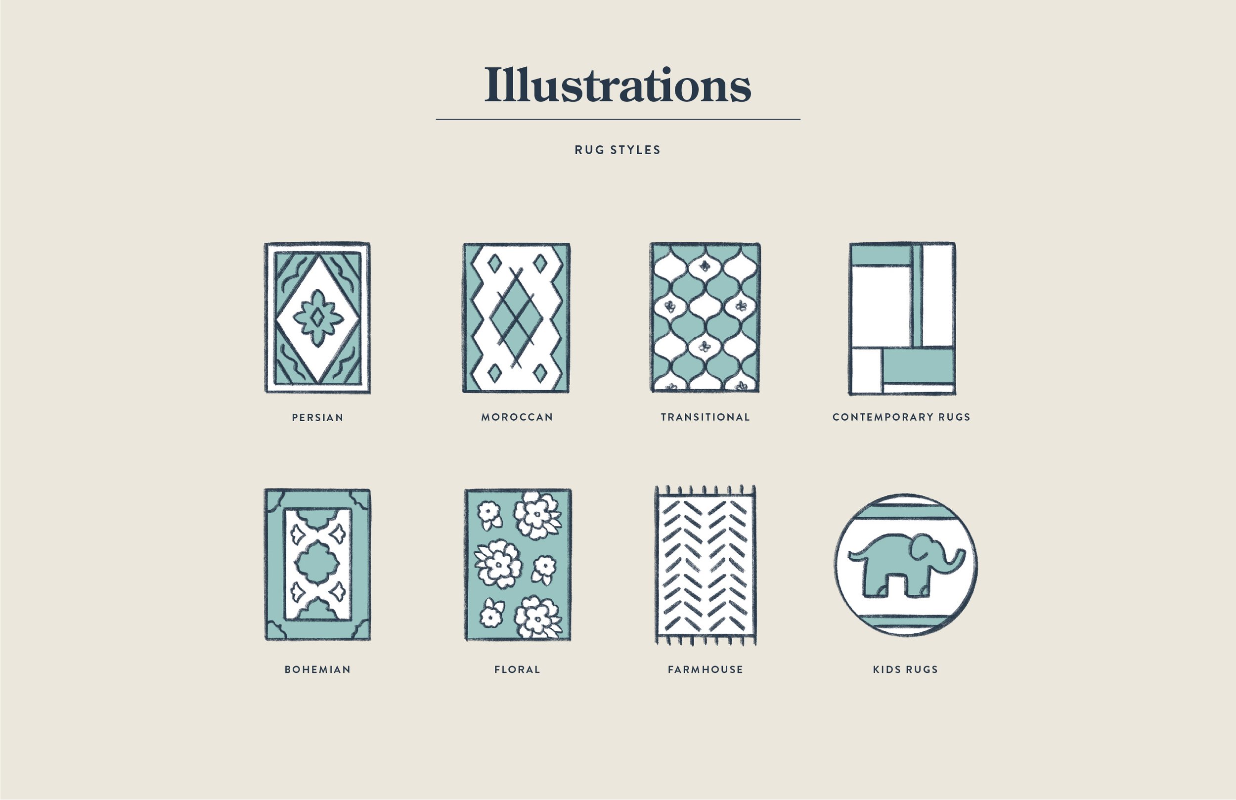
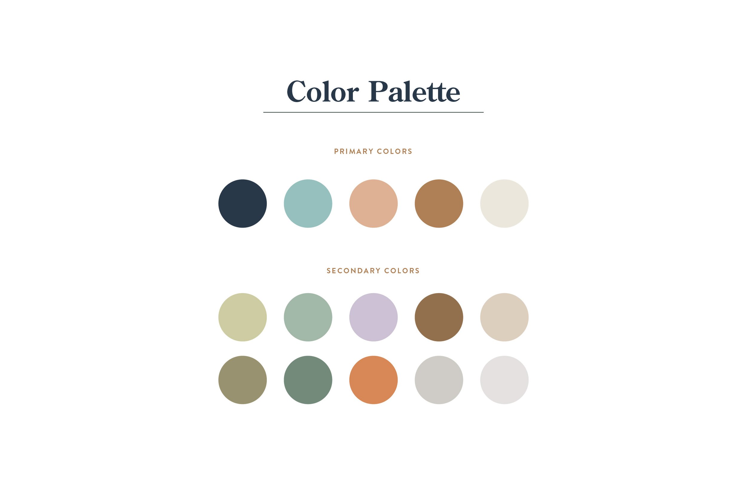
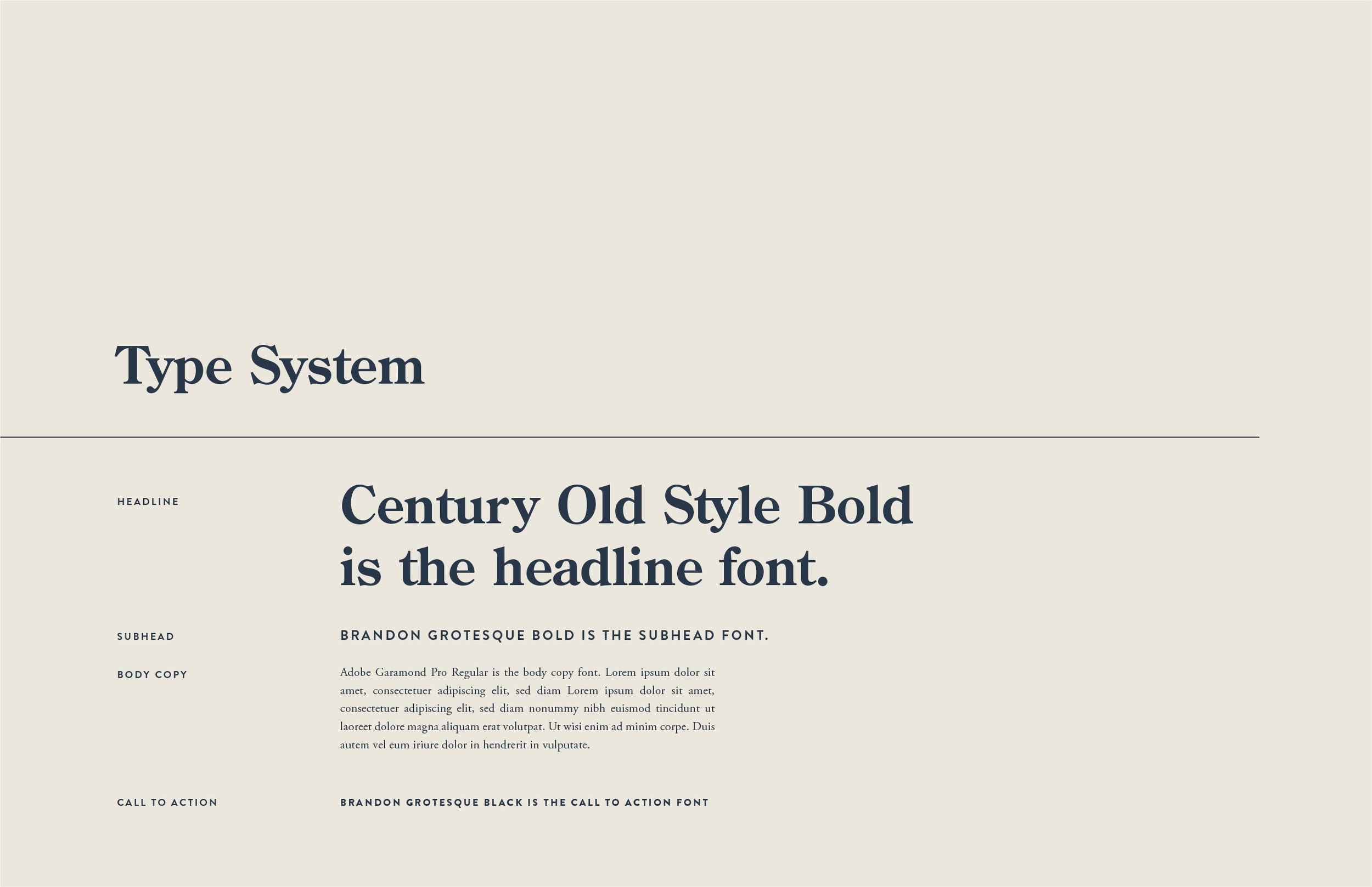
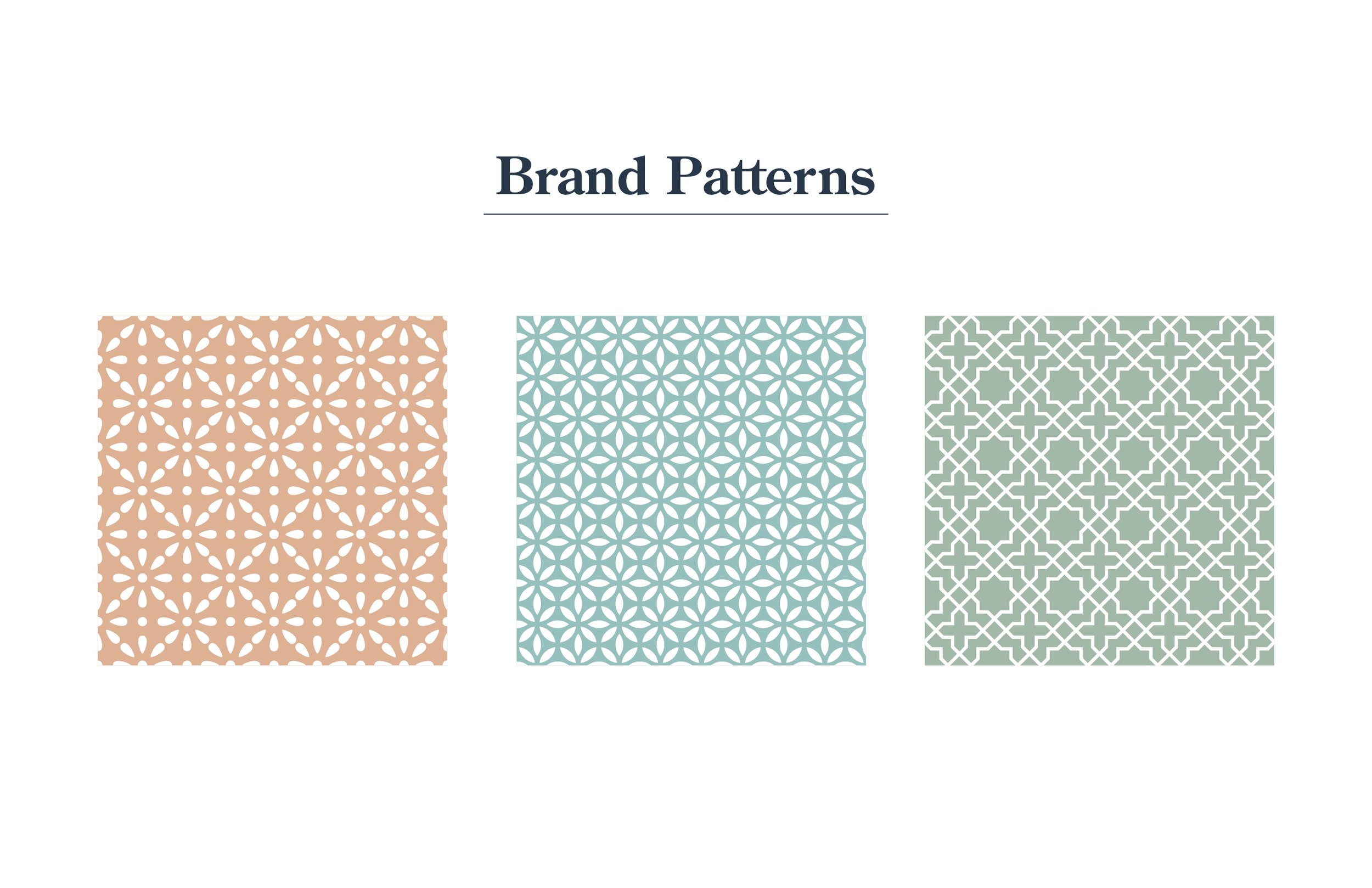
With the logo approved, I set out to design the rest of the identity. I created a set of secondary logos, several timeless brand marks, many hand drawn illustrations, the color palette, type system, patterns, and many examples of the brand in use. Since this brand comes with many moving parts that require printing and a release to a large audience, there were many rounds of revisions to get it just right. Adding new rug size illustrations, finding the right teal blue, packaging requirement changes, and so on. But after lots of hard work and speedy edits, the brand was approved! With the final files saved and exported to the client, we had a final brand and could begin the other projects in the lineup.
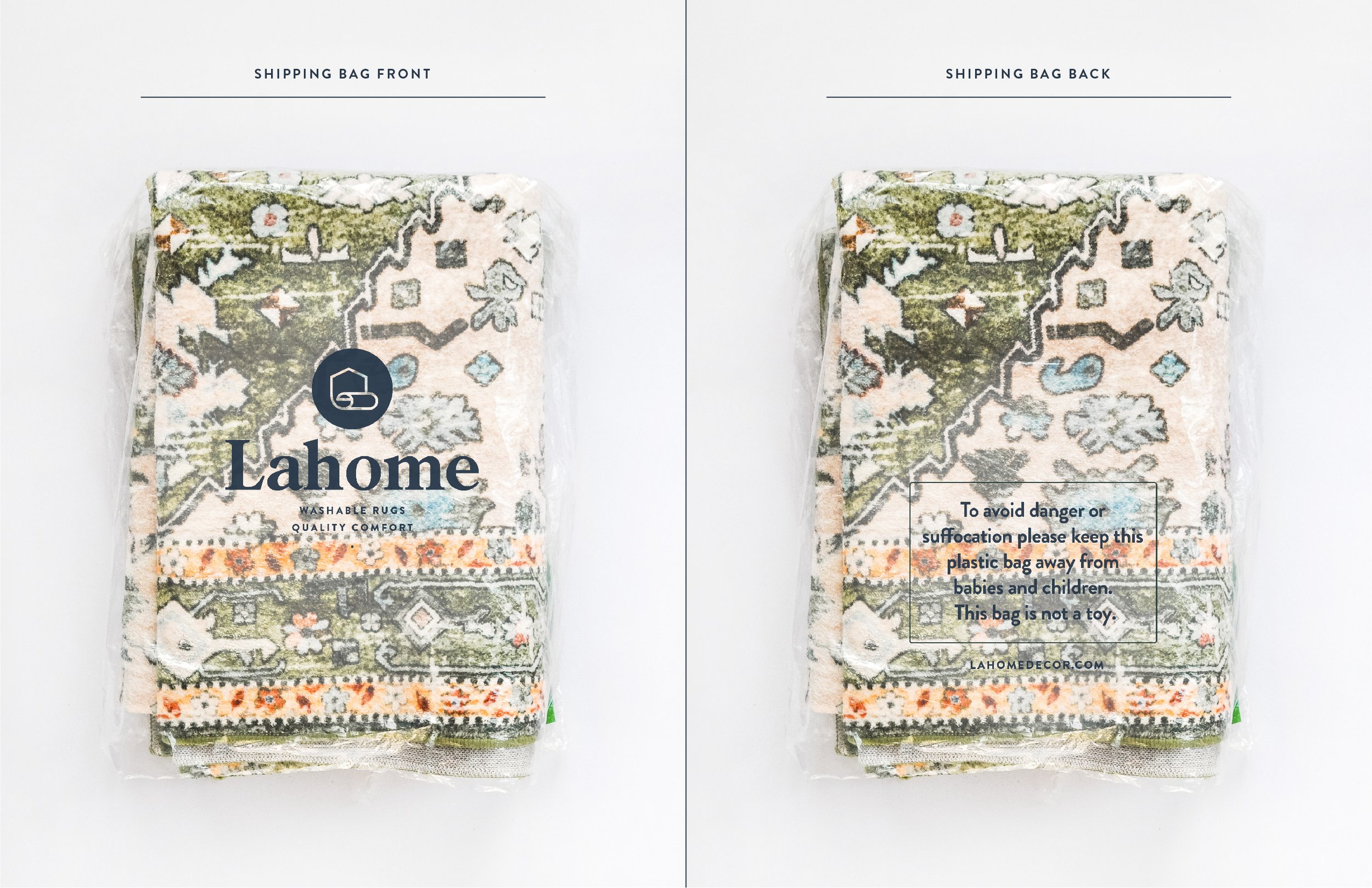
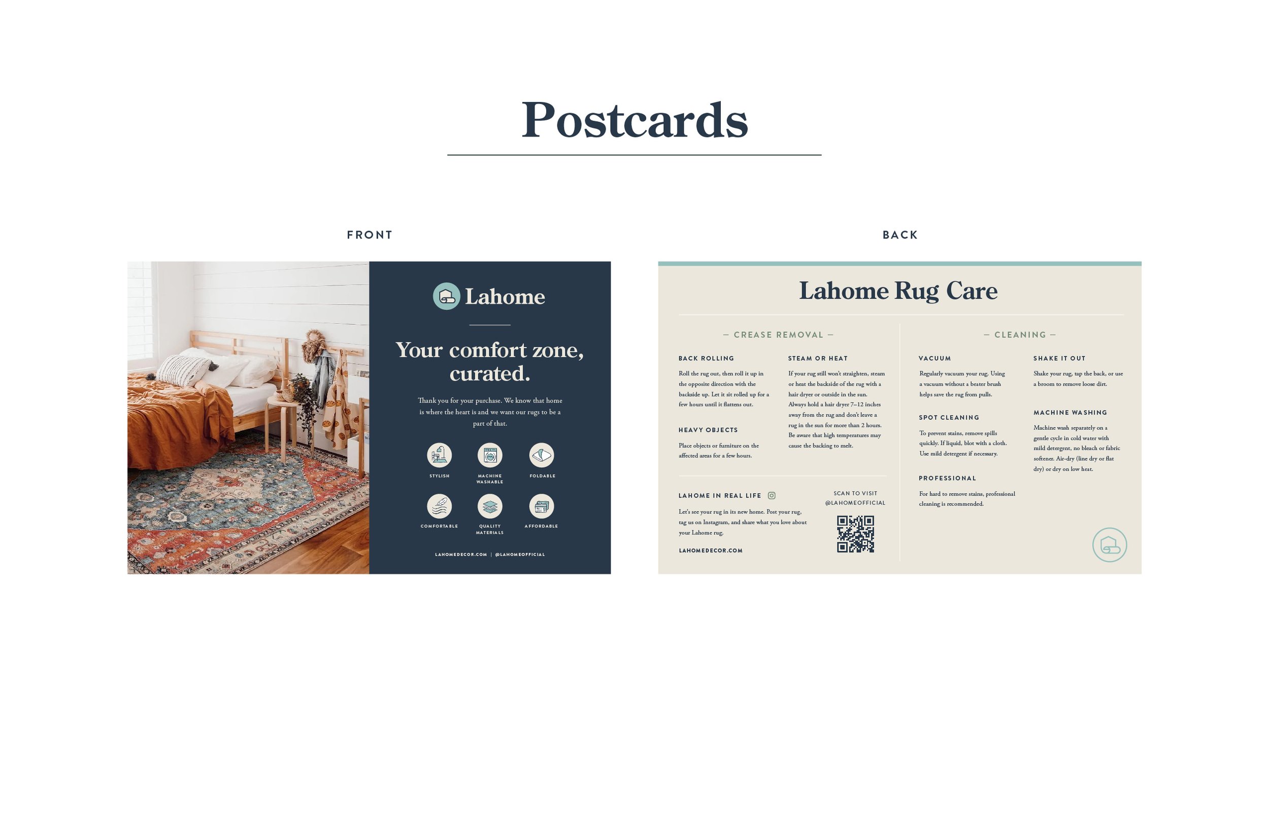
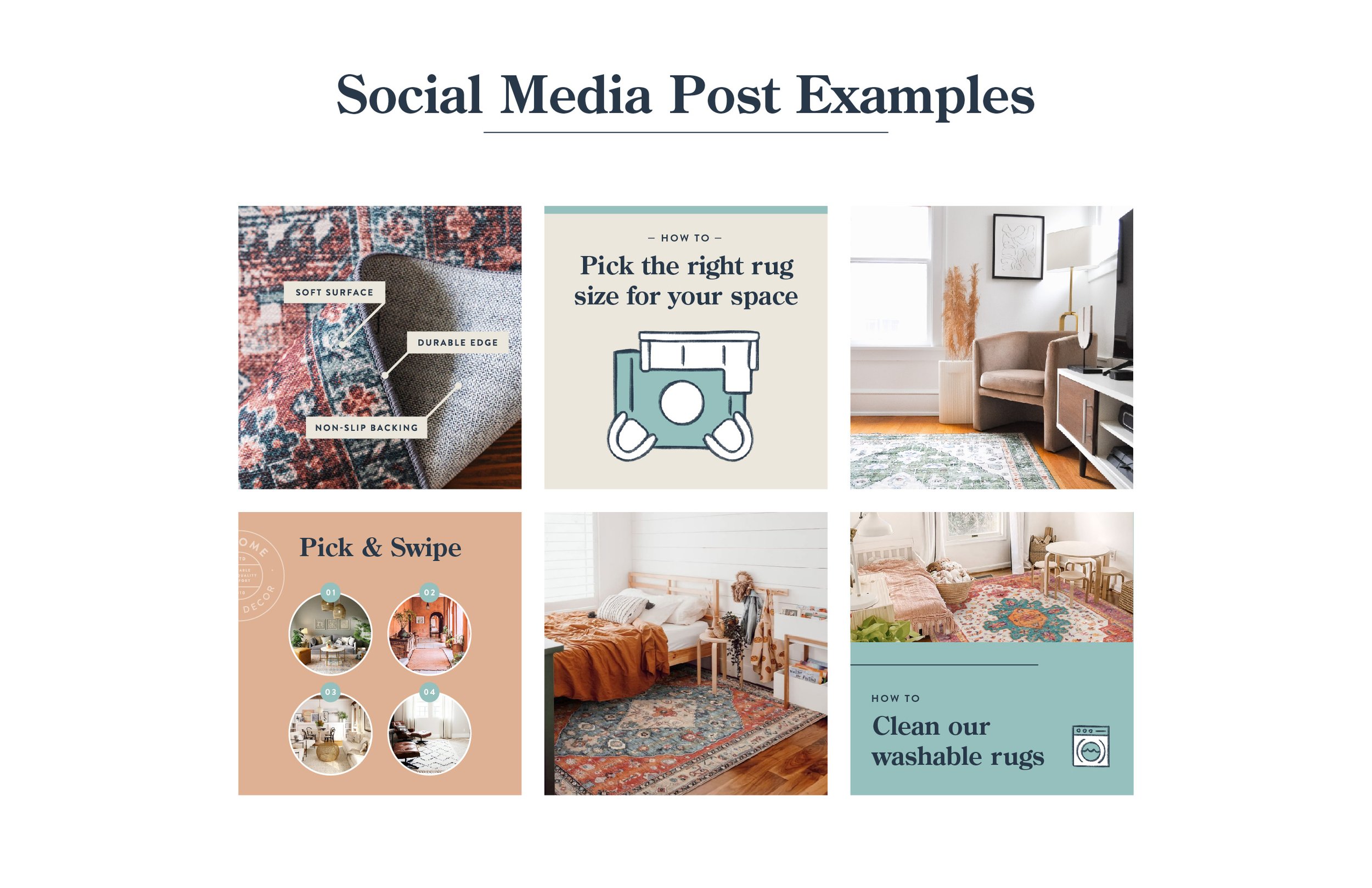
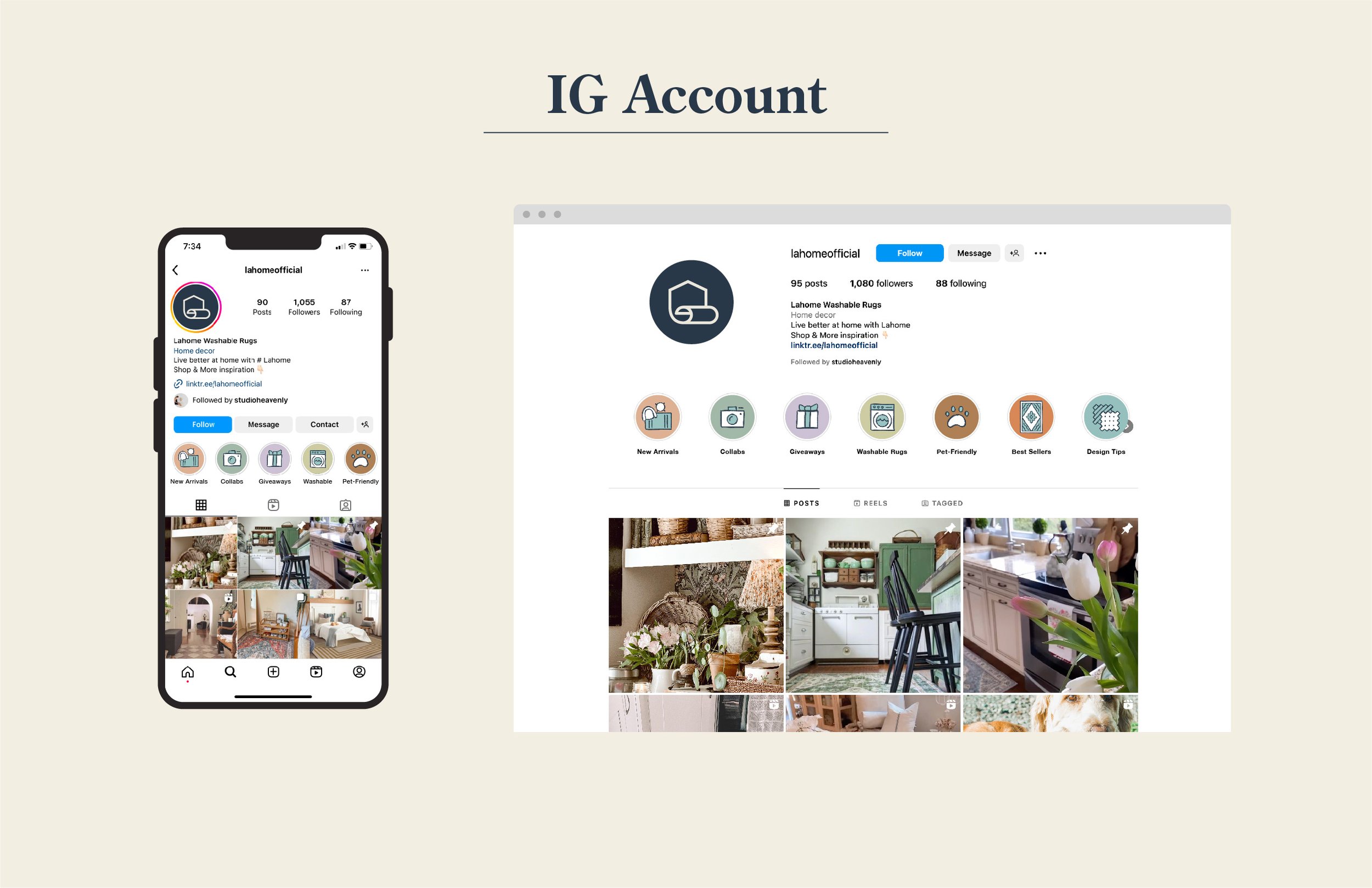
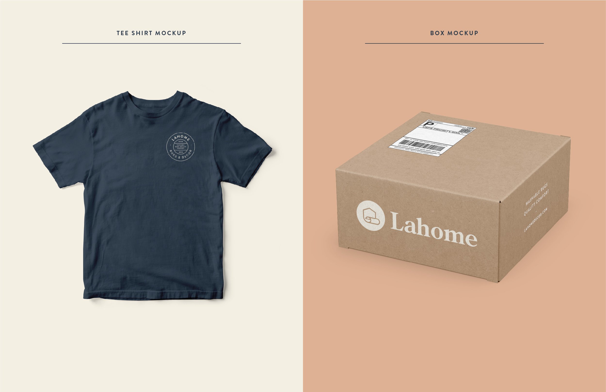
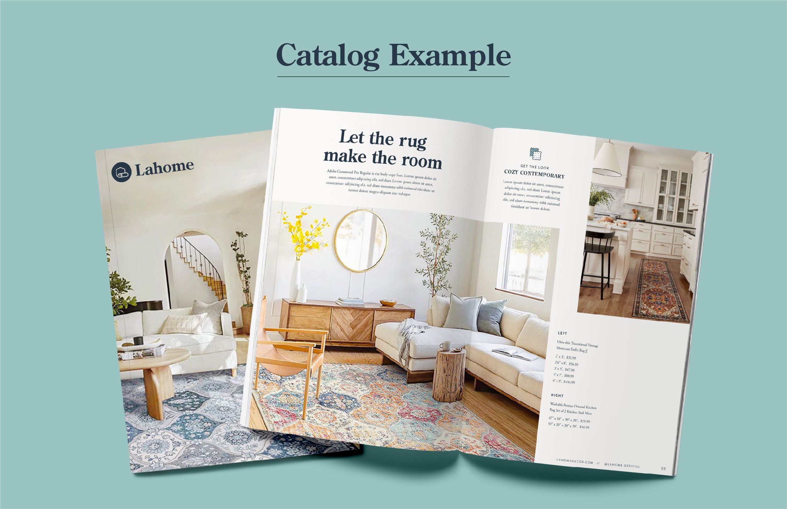
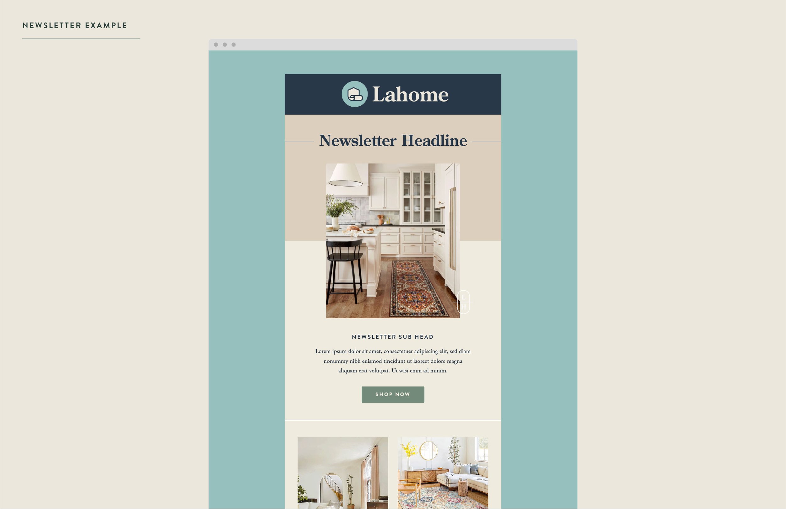
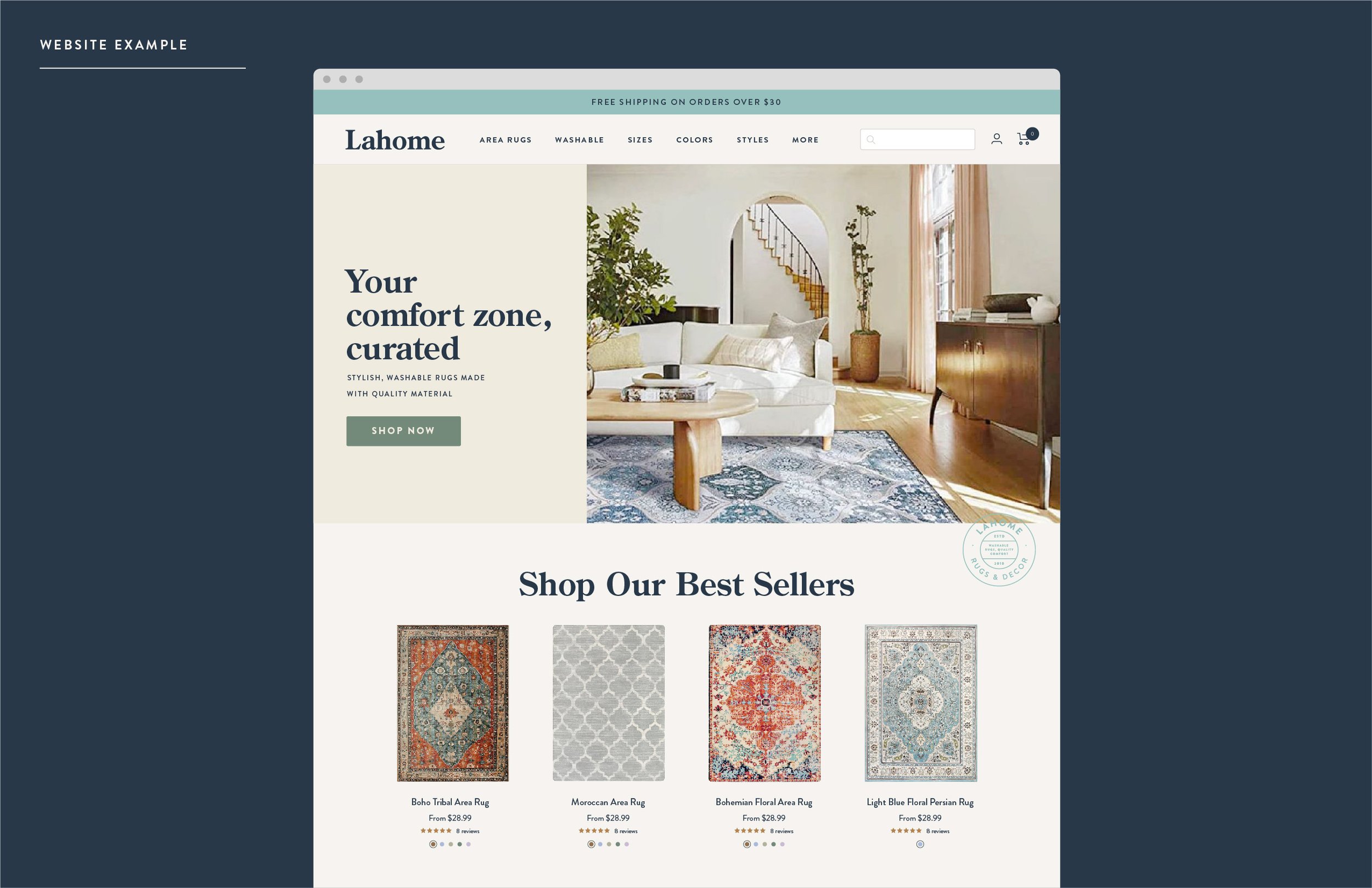
We knocked out the brand guidelines, social media templates, created the final packaging, edited some video templates and animations, and assisted with the Shopify website home page design. I had never used Shopify before so it was quite a learning experience and while the current site isn’t what we designed, it certainly gets the job done. All in all, the process was a rewarding challenge that I’m so excited to share with the world!